Responsive Web Design is a starting point, the user experience is the solution
Two of the biggest buzz phrases over the last few years has been responsive web design and adaptive web design.
While a responsive or adaptive approach to digital design and development can be a successful aspect of a digital strategy, they are by no means a silver bullet interactive solution in and of themselves. The keys to any successful digital experience are strategy, insight, research, and analysis. However, before we dive into the solution, lets take a look at the form factors of the existing mobile development options.

For those that have been busy playing Frogger on your Atari 2600 (…actually I would totally still be playing it if I still had it, bad example…how about for those that are saving files on 3.5” floppy disk? ) Responsive Web Design (RWD) is simply an elastic html/css framework that allows a website or application to scale and fit the dimensions of the device it is being viewed on (smartphone, tablet, laptop, desktop). Adaptive Web Design (AWD), on the other hand, usually refers to a separate, mobile-specific environment that is developed parallel to the desktop version of an online presence. A third option, which is a blend of RWD and AWD, is something that we call Tailored Web Design
Tailored Web Design is taking the best of both worlds, adding a health dose of progressive development practices and creating unique, tailored experiences whose goals are to fulfill both the user’s needs as well as the business goals within the context of the viewing medium, rather than simply fitting content into different sized containers.
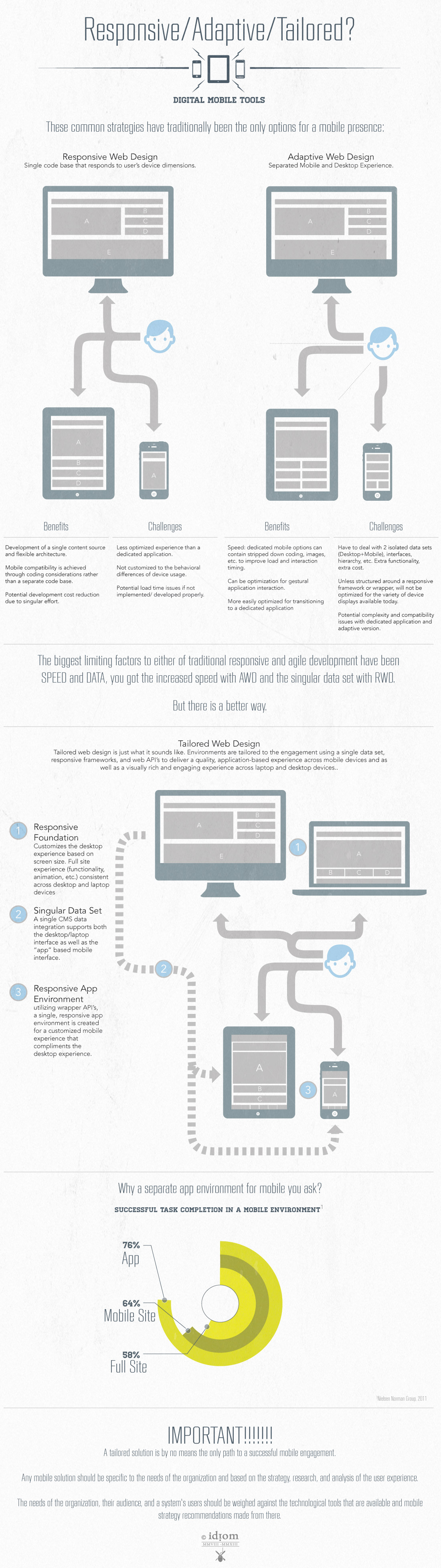
Not to go too far against the responsive movement grain, but both the Adaptive and Responsive Web Design approaches to mobile compatibility are just tools (albeit dynamic, beneficial, and functional tools), and, like any tool, the success of using them depends on making sure whoever is wielding the tool is using the right tool for the right job. The most important factor in order to get the most benefit out of these tools of digital development is to asses the specific business requirements, site objectives, and unique aspects of the project. By taking the time to look at the uniqueness of your business, we can strategically recommend which tools will most benefit your specific needs, and that is where user experience comes in.
Focus on the strategy, then use the proper tools.
In order to truly transform an online presence into an optimized, cross-platform digital experience, here are some factors that need to be taken into consideration.
- Strategy, Strategy, Strategy – We begin every project with this mantra (usually in our heads, sometimes in a pre-project huddle). Examine the reasons for addressing an existing website or creating a new one. Define what goals are to be achieved. Consider how a new digital presence can better engage your audience and what can be created to make an indelible connection with viewers. The technical tools and development strategy that will be the foundation for a successful project will begin to emerge once strategic definitions have been established.
- Know Thy Audience – The bottom line is by defining who the target audience is, we can create better, more specific solutions to enhance an engaging online presence. Starting with a foundational understanding of the audience, a content strategy that incorporates an audiences usage habits (desktop?, mobile?, tablet?, at home?, at work?, during the day?, during the evening?) can be defined and tailored to engage the audience across the spectrum of usage variables.
- Optimize the Content to the Context– In order to create a solution that truly responds to the user, the content of the website or application needs to be optimized for the context in which it is being accessed. Tailoring the digital interaction to specific environments (by accounting for how information is accessed through different devices, and how content and actions that are relevant to the audience is optimized) allows for a more customized and engaging experience.
Responsive or Adaptive frameworks are a good start, but a framework without forethought is like a car without an engine; looks good from the outside, but probably won’t take you very far.
Inherently, different device experiences require different considerations with content architecture and interactivity. The ultimate goal is to use the strategy, research, and analysis as the engine to optimize an experience. If the focus is on optimization for the experience across platform and device and you have the right digital team in place, the best tools for the job will ultimately be utilized.