Rebuild and Revolt: Designing for the User Experience in an Ever Changing Landscape
Inspiration (and design) is everywhere. If your eyes are open to it (just ask my wife, who has developed a wicked eye for design, and is now hopelessly aware of our designed world), it is almost impossible not to notice, critique, admire, or be inspired by the design that surrounds us every day.
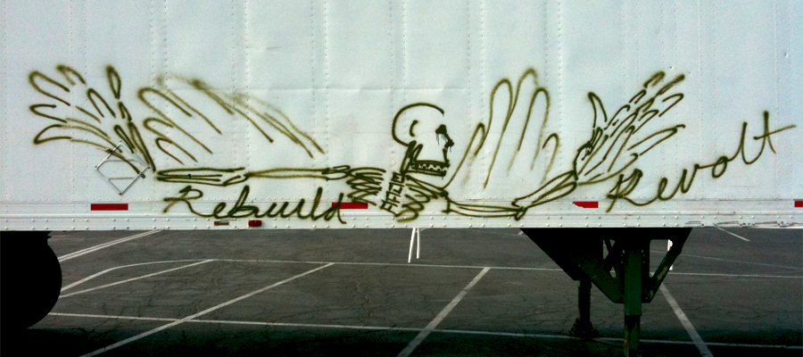
That is why I did a triple take when I saw this street art on the side of a semi trailer:

It is always interesting when something seemingly juxtaposed to the user experience (in this case, the personal expression of an artist) ends up perfectly embodying a personal ideal that I keep close when designing for the user experience.
Practicality First
At first blush, the idea of a revolt entering into an otherwise business-centered conversation may be off putting, but bear with me. We take a user centered approach to all or our projects and designing for the user experience is, at its core, a business conversation. It is our (and many other’s) belief, that if a creative, user-first strategy to business problems is followed, dynamic user experiences will be the result that achieve business objectives.
Now, digital experiences have inherent limitations. Certain constants exist that must be acknowledged and accounted for when crafting a user experience. The way the brain works and how the eye access information, cultural norms that dictate how information is most effectively absorbed, habits and behaviors of different demographics, and more all must be considered in order to create a successful experiential engagement.
Regardless of limitations, the goal of any engagement is to create a solution that solves a problem. And more and more, the dimensions of the device that the experience is being accessed on are becoming a limitation of limited importance.
User Experience in the Digital Space
The digital experience used to be much more controlled by device, and in the beginning it was easy.

Limited screen sizes, limited screen resolutions, limited processing speed, limited access options (remember Netscape?), and code development that was still in its infancy all contributed to a more homogenized experience. Plus, for the most part you were tethered to a box on a desk. There was no such thing as a user experience let alone device specific parameters!

Fast forward to now…massive screen parameter and resolution options, mobile devices and tablets with different screen densities, computers that act as phones, streamlined code that has the functionality and dynamic interactive capabilities once reserved for dedicated programs (I’m looking at you Flash) and a more digitally connected world that ever before (unfortunately browser options and version requirements still exist…damn you IE7!)
As the idea of user experience has come into existence, terms like cross device compatibility and mobile optimized content strategy have entered the zeitgeist. But, a strategy can only be as strong as the parameters that a given medium allows. So what do we do when the parameters of a medium are constantly changing and evolving? Our answer: move the user experience beyond the restrictions of device parameters and focus on situational optimization rather than the device restrictions.
Beyond the Device: Rebuild and Revolt
Evolution, especially in the digital space, is a constant. Technology evolves, products evolve, design evolves, and the experience of everything evolves along with it.
Constants (like the real world, human-specific aspects previously mentioned) will always remain. We can create better experiences that achieve better results and ultimately better ROI when we use those human constants as the basis for user centered strategy in a fluid, dynamic, and ever changing medium. Limiting content on a ‘lite’ or ‘mobile’ version of a website or application is inherently limiting the user’s experience. Which, in turn, can limit the user’s perception of a company.
Content and information, not the device, is king. And an important aspect of designing content for the user experience is to tailor it to be best used across situations, not devices. Shifting the focus from a device specific experience, to a holistic, user-based, goal-oriented one allows for the entirety of an online experience to evolve into seamless digital communication, rather than segmented, device-specific access to information.
By questioning existing structural paradigms and challenging usability conventions that are on their way to becoming eclipsed we can create better solutions, better experiences, and better products.