Typography Design Matters
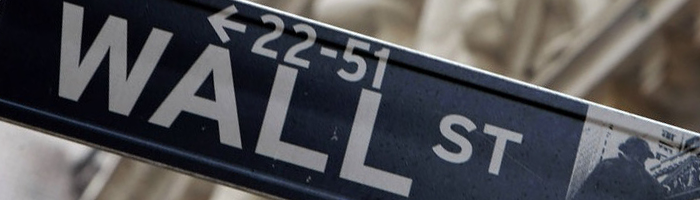
New York City recently announced that all of its ALL CAPS street signs will be replaced with case sensitive signs to the tune of $27.5 million.
This is in accordance with national safety standards. An article about it can be found here.
The project is expected to last through 2018.
As designers this article spoke to us for a few reasons.
The first being:
Typography Design Matters and is Impactful
No matter how you look at it, the ALL CAPS typography design of the street signs in NYC will cost the city almost $30 million dollars. That isn’t even including what cost of the signs in the first place! Now of course the majority of the cost involved will be the material and labor to remove and replace all the signs, but someone will have to change the lettering of every single street sign in the city…all 250,000 of them. And who will that person be? Most likely someone with design software and fruit on their computer…a designer.

As designers, we have a unique position in the world as often we are the translators between entities. Businesses communicating with consumers, governments communicating with their citizens, businesses communicating with businesses… All use language and visual elements to get the message across, but it is ‘stuff’ of the language and visual elements that is at the heart of communication. How the language of visual communication is crafted, how it are constructed, can say as much about the message that is being conveyed as the actual message itself.
Initially the city (and most likely many cities around the country) thought,”Well…they are street signs, so we need the letters to be as big as possible so they can be seen from a distance.” This is a fine thought, if not for the second reason…
ENGLISH LANGUAGE READERS DON’T READ LETTERS.
As language and writing skills are developed, the English eye learns to read the shape of words rather than the word itself. We use word shape recognition using the pattern of ascending, descending, and neutral characters, rather than the letters that make up the word.

It is actually faster and easier to read a word with varying degrees of character shapes than it is to read a word set in all caps. Now anyone who has taken a Typography class will have undoubtedly come across this information, but it is most likely not that readily known if type and design aren’t part of your daily life. If I were a betting man, I would say the powers that be in NYC weren’t dealing with type on a daily basis and therefore didn’t think of the importance of not only the size and voice of the message they were trying to get out (bold colors, big all-caps letters tells me…THIS IS A SIGN AND YOU NEED TO PAY ATTENTION), but the audience they were speaking to. Either that or they inadvertently sacrificed legibility (and by extension safety, according to the Federal Highway Administration) for authority. Which sign, if either, are you more likely to listen to? Is there a difference?

The sign on the right is easier to read, but do the signs say the same thing to a driver?